Custom Display Designer Interface

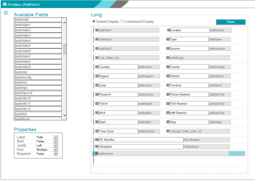
The Custom Display Designer includes the following sections:
- A title bar that shows the current area and table.
- A work area that includes the following sections:
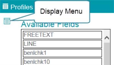
- The Display Type menu (
 ) lets you select the display type, delete a customized view, or copy the current view to a different display type. Hover over the button to display the available options for the current form.
 - The Available Fields list shows only those fields that can be used on the current form. Add a field by dragging it to the form layout, or remove a field by dragging it off of the form layout.
- The form layout section lets you toggle between Default and Customized Display views to see how the fields are displayed on the form.
- The Save button lets you save your changes.
- Properties let you apply display options to row or field, depending on the item selected in the form.
- Field properties let you specify whether to display or hide the field label, specify required fields, and set the font and alignment properties for the selected field.
- Row properties let you move a row up or down, specify whether the row should display as a wide row, or remove the row from the form.
- The Display Type menu (
- For each form, only one custom display definition can be created for each screen layout option. For example, you can create only one Long Mode display customization for Address data.
- Not every Customize Screen Layout option is available for every form that you can customize. For example, you cannot create a custom eDirectory definition for Planned Giving data because Planned Giving data is not part of the Online Constituent Directory.
-
The Java version of the Custom Display Designer required you to customize the Long view before the Maintenance view could be customized. The web version of the Custom Display Designer no longer has this restriction. You can customize the Maintenance view independently of the Long view.
Title Bar
The title bar in the Custom Display Designer shows the currently selected form and table, based on your choices in the Millennium Explorer menu and in the form selection menu ( ) at the left of the title bar.

Display Menu
The form layout options are located on the Display menu in the work area, below the title bar.

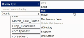
Use the menu to select the display definition that you want to customize. Switch between the display options by selecting the relevant menu item. For more information about display types, see

Note: Only the views that can be used for the selected table are available. The currently selected view is disabled in the menu because it is already selected.
| Menu Item | Customized View |
|---|---|
| Long | Long view. The Long view is selected by default. |
| Short | Short view. The Short view is normally a subset of the fields displayed in the Long view. |
| Mini | Mini view |
| Mobile | Mobile devices |
| Maintenance Form | Insert and Update forms |
| Mobile Maintenance | Insert and Update forms on a mobile device |
| eDirectory | Display and Maintenance forms used by the Online Constituent Directory |
| Snapshot | Snapshot view |
| One Screen | One Screen view |
Available Fields
The Available Fields list shows all of the table fields available to the selected form and view. If a field is restricted for the form or view, it is not displayed in the list.
You can use the Available Fields list as follows:
- To add a field to a form, drag it from the list to the display. Drop the field into a new row or into a row with available space.
- To remove a field from the form, select the field and drag it back to the Available Fields list. Use the field properties to customize the field label and display properties.
- To remove an entire row from the display, highlight the row and select Remove in the row properties.
Display Area
The display area is labeled with the display type you selected from the Display menu (for example, Long, Short, or Mini). The display area includes action buttons at the top, rows and fields representing the form as it is displayed to the user.
Actions
At the top of the display area, the Default Display and Customized Display options let you toggle between the standard and customized versions of the form. The Save button lets you save your changes to the customized form.
These actions let you work with the default and customized displays as follows:
- Use the Default Display and Customized Display options to toggle between the two versions of each display type. For example, if the Customized Display option is selected, choose Default Display to show the default layout for the selected display type.
- If no customized display definition exists for a display type, the Default Display option is selected by default and the default layout is shown in the work area.
- If a customized display definition exists for a display type, the Customized Display option is selected by default, and the customized layout is shown in the work area.
- The display that you save is the one that is presented to all users of the form. Use the Save button in the work area to choose the display that will be shown to users when they load the specific form and display type.
- The Default Display for each form and display type is always available. You can always return any display type to its default view by selecting and saving the default display for the selected form and display type, or by using the hover menu and selecting Delete Custom display.
Rows and Fields
Within the display area the rows and fields for the form are layed out as they appear to the user. Use the tools in the display area to modify rows and fields.
The display area places a blank row at the bottom of the form automatically. Each time you add data fields to this blank row, a new blank row is added, so you never need to add a new row to the form.
You cannot delete this placeholder row. If there is more than one blank row on the form, you can delete any additional empty rows.
Selectors
Use the row or field selectors to highlight a specific field or an entire row. Changing the selection between a field an a row also changes the options available in the Properties list.
- Use the row selector (
 ) to highlight all fields in a row. You can use the row properties to move a row up or down in the display, or remove it from the form.
 - Use the field selector (
 ) to highlight a single field. You can use the field properties to specify how the field is displayed in the form or drag the field to an open space on the form.
Labels
Use the Label text box to define how a field is labeled in the display
The Label property must be set to Show for the field or row for the Label text box to be visible. See Properties for more information.
Click the X in the text box to clear an existing label and enter a new one.
The following characters are restricted and must not be used in a label:
& (ampersand, except when defining a Maintenance form hot key)
^ (caret)
|(pipe)
/ (forward slash)
: (colon)
; (semicolon)
A field label defaults to the value held in the alias field of the Field List (fieldlst) system table for field. When a display definition is saved, the changes to the data field labels are saved in the Field List table (field name, alias) and they become the default label values.
However, if you remove a label from a Customized Display, the alias is not removed from the Field List table.
The hot keys on each Maintenance form are customized by using the Label Text Box with the ampersand (&) character as the indicator for the hot key.
Properties
Use the Properties list to modify the appearance of the form rows and fields.
Row Properties
When you select a row on the form using the row selector (  ), the Properties list shows the following options:
| Option | Description |
|---|---|
| Move Up | Use this option to move the selected row up one position on the form. |
| Move Down | Use this option to move the selected row down one position on the form. |
| Remove | Use this option to remove the entire row from the form. |
Field Properties
When you select a field on the form, the Properties list shows the following field properties
| Option | Description |
|---|---|
| Label |
Use this property to Show or Hide the label for the selected field. Show must be selected to edit the label. If you Hide the label, the data field value displays left-justified in the field. For example, you might hide the label on the second or third address lines. Note: Labels can be hidden only on data display forms. Labels must be shown on maintenance forms, so that the user knows the how to enter data in each field. |
| Bold |
Use this property to render the data for the selected field in boldface.
This property must be set for each field to be shown in boldface. |
| Value |
Use this property to specify whether the data field displays the code or value representation of the data from the lookup table. This property is only available if the field is a lookup-data-driven field.
This option applies only to the display of the data. During data maintenance, lookup-table-driven fields show codes or values in accordance with the defined user options. See User Options, Lookup Option for more information. |
| Justify |
Use this property to set the data alignment to the Left or Right of the text box.
The following fields cannot be displayed as right justified:
|
| Row |
Use this property to specify whether a row can contain multiple lines. This property is available only for comment and custom text data fields.
Both multi-line and single-line text boxes scroll so that the contents can be viewed. Comment and custom text fields are flagged as such in the field list (fieldlst) system table. The display type (displaytype) for these fields is set to T. |
| Required |
Use this property to specify whether the field is a required field.
This property is not available for flag fields (Yes/No), or for lookup-data-driven fields. To enable the Required property for a lookup-data-driven field, the blank code and value row must be removed from the lookup table. Note: If the values in the lookup table exceed 30 characters, display the data in a wide row to avoid scrolling. |
| WideRow |
Use this property to specify whether the field should occupy the width of the form.
Note: Some data fields (for example, comments) must display as a wide row. In these cases, the Wide Row property defaults to True and cannot be changed. |