Dashboard
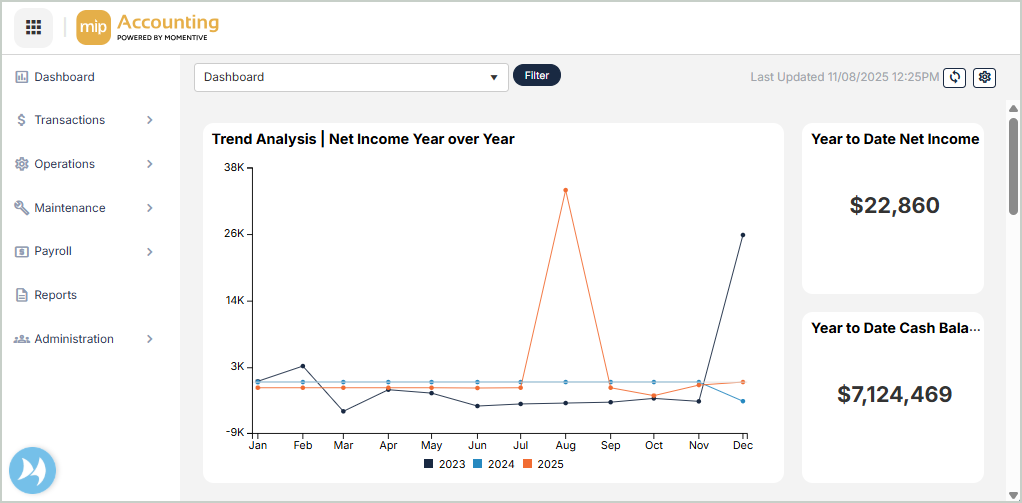
The MIP Dashboard gives you a detailed summary of your organization's financial state for the current fiscal year. You can design and run dashboards, charts, and reports to keep track of your financial data. The system default view of the dashboard includes four Key Performance Indicators (KPIs) and three chart types (bar charts, line charts, and donut charts). The charts and KPIs allow you to drill down into GL Codes and further down to the document list level.
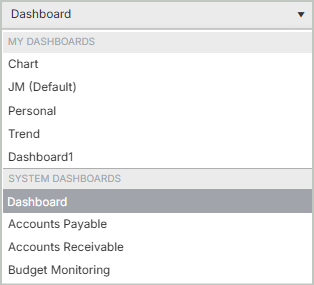
Select a Dashboard
Select the drop-down at the top of the page to display a dashboard of your choosing:
Filter Your Dashboard
Select Filter located next to the dashboard drop-down to filter the organizational data in your dashboard.
-
Select a Chart of Accounts Segment.
-
You can filter the results displayed by Single Segment Code or Report Group.
-
Once you're finished with your selections, Save your changes.
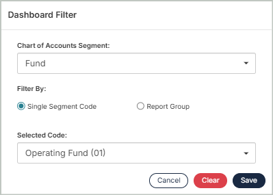
Note: The filter parameters you set above will display next to the Filter button. Select Remove to clear the filter parameters. Filters stay applied until removed, even when logging in and out of MIP. Switching between dashboards changes the filter to the one applied for that particular dashboard.
Refresh Your Dashboard
Select the Refresh button at the top right corner of page to replenish your dashboard with the most recent data. The time stamp next to the refresh button displays the last updated date and time.
Modify a Dashboard
Select the Gear button at the top right corner of the page to open Dashboard Options, where you can modify or create custom dashboards.
Charts & KPIs
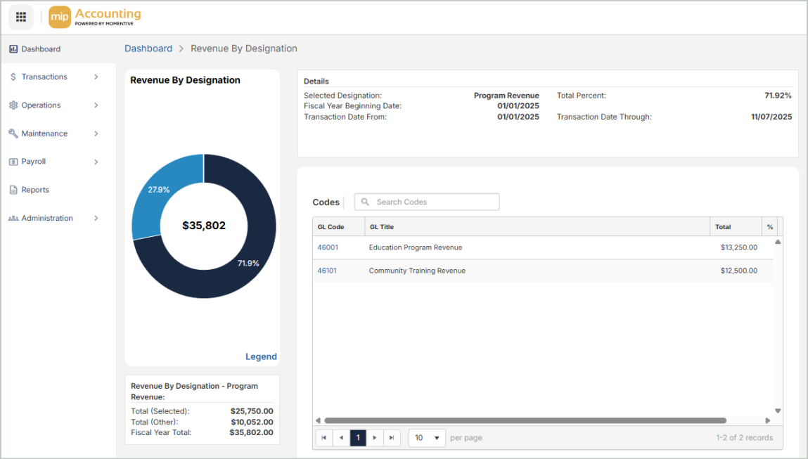
Select any chart from the dashboard to drill down further into the features and specific GL code documents. The default set of charts displays role-based data, such as comparative totals over time or a breakdown of revenue and expenses. The default KPIs display a snapshot of your organization's current financial status.
The following charts are available to display on the dashboard:
- Trend Analysis | Net Income Year over Year: A line chart comparing your organization's net income month by month across the current fiscal year and the two previous years.
- Actual Expense vs. Budget Expense: A bar chart comparing your organization's actual expenses to budgeted expenses for the current fiscal year.
- Revenue By Designation: A donut chart displaying your organization’s year-to-date revenue, broken down by designation. Only designations with at least one recorded transaction are included.
- Expense By Designation: A donut chart displaying your organization’s year-to-date expenses, broken down by designation. Only designations with at least one recorded transaction are included.
- Aged Payables: A bar chart displaying the unpaid amounts currently owed to creditors by your organization.
- Aged Receivables: A bar chart displaying the outstanding amounts owed to your organization.
- Outstanding Payables: Your organization's current unpaid Accounts Payable invoices.
- Outstanding Receivables: Your organization's current unpaid Accounts Receivable invoices.
- Year to Date Cash Balance: Your organization's total cash on hand from the beginning of the fiscal year up to the current date.
- Year to Date Net Income: Your organization's total profit or loss from the beginning of the fiscal year up to the current date.